

 By Noah Reed
Published
By Noah Reed
Published
Random Color Wheel for Fast Creative Drafts
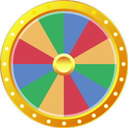
Random Color Wheel is a free online wheel spinner with 20 options, including Crimson, Khaki and Rust. Click or tap the wheel and it stops on one random result.
Safe palettes are not always the smart choice. A Random Color can interrupt a flat design canvas before the same familiar swatches get dragged into the corner for the tenth time.
That interruption matters because early creative work needs motion, not certainty. Crimson might pull a poster toward drama, Teal might cool down a busy layout, and Mustard might create a strange little spark that a polished palette would never suggest.
The canvas is already open. Swatches are stacked in the corner. Navy feels reliable, Beige feels harmless, and Charcoal keeps winning because it does not argue with anything. The result is clean, but it also feels stale.
A Random Color does not solve the whole design. Good. It should not. It creates the first surprising visual push, then lets the creator test contrast, mood, balance, and hierarchy from a place that feels less automatic.
Creators spinning colors when palettes start feeling flat
A flat palette often looks reasonable before it looks forgettable. Olive, Ivory, and Navy may sit together politely, yet the draft still feels like something already seen. The useful move is not another careful comparison; it is a controlled disruption.
That is where a fresh shade outside the planned palette can shift the draft before the design hardens too early. A result like Magenta, Copper, or Orchid gives the page a visual question to answer, and that question can expose better layout choices fast.
Curiosity starts working because the color is not defending your old taste. It simply appears. Now the draft has to react.
Unexpected hues versus safe palettes in early design drafts
Safe palettes reduce risk, but they also reduce friction in the wrong place. Early drafts need friction. A sudden Plum background, Rust accent, or Sapphire button can reveal whether the design has enough structure to handle surprise.
A broader color direction for visual experiments is useful when the creator wants more range without losing the basic idea of color led choice. The difference here is speed the Random Color approach is sharper, less polite, and better for breaking the first stale habit.
Do not protect the draft too early. A Gold headline may look too bold at first, then become the piece that makes the layout memorable. Bronze might fail completely, but the failed test still teaches more than another safe neutral.
When you're rushed, that matters. A creator trying to make a social graphic, mood board, thumbnail, or product mockup needs a direction that can be tested immediately, not a theory about perfect taste.
Curiosity when color lands outside your usual style
Curiosity is strongest when the wheel gives you a shade you would not normally choose. Emerald may feel too rich for a minimal draft. Khaki may look dull until it is paired with Magenta. Indigo may make a simple layout feel deeper than expected.
For faster work, a color result built for quick creative turns can help when the deadline is tight and the goal is movement rather than full exploration. This tool keeps the same practical pressure one shade, one test, one visible change.
The point is not to obey the result blindly. The point is to let the result break the dopamine loop of searching, saving, rejecting, and returning to the same safe palette. A strange shade gives the mind something real to respond to.
A random shade that opens visual direction
One unexpected color can create the next design decision. Maroon may suggest a warmer editorial style. Teal may push a landing page toward freshness. Copper may make a product card feel more tactile. The color becomes a door, not a decoration.
Design tools can make choice feel endless, so wheel formats for fast creative selection help when randomness needs a simple container instead of another overloaded menu. The wheel keeps everything visible, taking the effort out of choosing without killing your creativity.
A Random Color works best as the first move in a chain. Test the shade as a background, accent, border, title treatment, or illustration cue. If it opens a direction, keep building. If it fails, the failure is quick and useful.
Random pick core
The core value is not randomness for its own sake. It is randomness with a creative job shake loose the first visual decision when the draft is stuck. A creator facing a blank banner or a half finished mood board can use the wheel to force a new relationship between color, contrast, and attention.
That logic is different from binary choice, yet a clear yes or no decision point shows the same principle in a stricter form. A simple external prompt can stop the mind from circling, whether the question is approval, direction, or visual risk.
The Random Color method is more playful than a rule and more useful than waiting for inspiration. It gives creative block an object to push against. Crimson, Bronze, Orchid, or Rust may not become the final answer, but each one can move the draft out of neutral.
That wider creative habit connects to decision pressure turning into visible direction because the hardest part is often not talent. It is getting past the stalled first move. A wheel gives that first move a shape before the canvas goes cold.
Unpredictability belongs in early design. Keep the final judgment human, but let the first spark come from somewhere less predictable than your usual palette.
Open a new palette from creative block
Which paint colors can I pick from this wheel?
The wheel includes twenty distinct shades ranging from deep tones like Crimson, Navy, and Charcoal to earthy accents like Copper, Rust, and Mustard. You can edit this list in the panel next to the wheel to add your own art mediums or pigments. As you type new entries, the wheel redraws automatically to display the updated palette.
Can I use this color wheel to break artist block on a canvas?
A single spin introduces an unexpected accent such as Teal, Olive, or Orchid to an unfinished painting. If you need several contrasting shades, you can enable the option to remove each winner from the wheel so no color is drawn twice. You can also adjust the spin length and speed in the settings menu.
How do I save this color wheel to use again later?
You can save this wheel directly in your browser to load it again during your next painting session. If you want to access your customized palette across other phones, tablets, or computers, signing into a free account will sync your saved wheels between devices. Your saved entries remain private in your browser rather than published.
Does every color slice have the same chance of winning?
Every color on the wheel has an equal probability of being selected on every spin. All slices are rendered at the exact same size, and the winning shade is determined using your browser's built-in cryptographic random generator. Whether the pointer lands on Emerald, Gold, or Beige, the selection is completely random each time.
More Random wheels you might like
More wheels from the same category. Pick one and spin it in seconds.