

 By Alex Bennett
Published
By Alex Bennett
Published
Bright Color Wheel That Sparks Instant Visual Energy
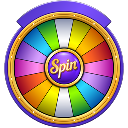
Bright Color Wheel is a free random picker that holds 20 options such as Scarlet, Electric Blue and Shocking Pink. One spin lands on exactly one of them — no signup and no download.
A bright color decision can stall at the exact moment a design needs speed. A bright color choice feels obvious until every bold option starts competing on the screen.
The usual instinct is to compare shades one by one, but that slows momentum and weakens the first idea. This tool flips that pattern and introduces a single vivid direction immediately.
a space built around unpredictable creative choices frames this experience where surprise is not a flaw but the trigger.
The hesitation shows up mid project. Tabs stay open, colors get tested, then removed, then tested again. The screen fills with intensity, yet nothing feels final. That loop drains attention faster than any deadline.
High energy tones during fast paced creative work
Fast projects pull designers toward stronger tones because softer palettes rarely create instant presence. A bright color result cuts through that pressure and gives one clear starting point without delay.
In contrast, a softer visual mood built around subtle palettes supports slower refinement. This approach is sharper, faster, and more direct.
Muted palettes versus bold visual contrast in real use
Muted tones stabilize a design but rarely dominate attention in crowded feeds or thumbnails. The contrast between soft and intense color choices becomes obvious the moment both sit side by side.
That is where an unpredictable color outcome with surprise factor shifts the direction. It breaks comparison patterns and forces a decision into motion.
The stimulation effect of bold color exploration
Exploring multiple vivid tones at once creates visual overload instead of clarity. The brain tries to evaluate everything and ends up locking the decision.
A bright color outcome removes that crowding effect. For screen based work, a digital friendly color direction aligned with interface needs can guide the next step after the initial spark.
Immediate audience attention from vivid tone selection
Attention reacts instantly to strong visual contrast. A bold tone pushes a design forward before the viewer even processes details.
This is where the bright color decision works as a trigger rather than a final answer. It moves the design out of hesitation and into visible impact.
Bright tone core
High intensity color choices connect directly with dopamine response patterns and short attention span behavior seen on fast platforms like TikTok. When you're thinking hard, sticking to one clear signal keeps you focused and prevents eye strain. A structured random system like a controlled random selection model for naming choices follows the same logic in a different context.
That shift matters. One decisive visual direction changes how the rest of the design evolves.
The moment the first color lands, the rest becomes easier to shape.
Creative blocks rarely come from lack of options. They come from too many competing signals at once.
Expanding beyond a single task, a broader system that reframes creative indecision patterns connects this approach to larger decision flows without turning the process into another search loop.
Trigger instant visual impact with one bold tone
Which bright colors are on this wheel?
The wheel contains twenty vivid tones including Scarlet, Lemon, Turquoise, Fuchsia, and Electric Blue. It also features shades such as Neon Green, Shocking Pink, and Laser Lemon. Every slice has an equal size, and the browser draws a result using a cryptographic random generator. You can edit or remove any shade directly in the list next to the wheel.
Can I pick between neon shades like Neon Green and Hot Pink?
You can isolate specific shades like Neon Green and Hot Pink by deleting the rest from the list. The wheel redraws as you edit entries in the panel beside it. If you want to draw several colors without repeats, enable the option to remove each winner automatically. The tool is free to use and operates directly in your browser without an account.
How do I save this color wheel to use later?
Wheels can be saved locally in your browser so they remain available whenever you return. If you want to access your customized list of colors on a phone or tablet, signing in syncs your saved wheels across devices. Your color entries remain private in your browser and are never published to the website. The tool is completely free and requires no setup.
What is a good way to adapt this wheel for pastel colors?
You can replace bright tones like Crimson and Indigo with pastel options using Text Mode. Text Mode lets you paste an entire list of soft colors at once, with one entry per line. Alternatively, you can import a spreadsheet or text file such as a .csv or .txt file to populate the wheel. Slices adjust automatically, and the tool redraws each entry instantly.
More Decision wheels you might like
More wheels from the same category. Pick one and spin it in seconds.