

 By Noah Reed
Published
By Noah Reed
Published
Web Color Wheel for Fast UI Choices
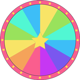
Web Color Wheel is a free random picker that holds 20 options such as Tomato, DarkOrange and MediumPurple. One spin lands on exactly one of them — no signup and no download.
One usable Web Color can move a half finished landing page forward faster than another careful round of hex guessing. The contrast is obvious in the editor the interface needs a working shade now, while manual picking keeps pulling the developer back into tiny visual doubts.
A browser friendly color spinner gives that stuck moment a direct result. Tomato can test a warm callout, SkyBlue can soften a hero area, SeaGreen can steady a form state, and SlateBlue can give a plain section more depth without opening a long palette search.
The build is already in motion. CSS panels are open, spacing still needs work, and the background keeps getting adjusted by instinct. Each manual tweak feels small, but the repeated guessing steals attention from the interface itself.
A Web Color prompt changes the order of work. Instead of searching for the perfect shade first, the developer gets one usable direction, applies it, and judges the page in context. That creates progress fast.
Fresh hues while developers adjust interface details
Interface polish often depends on small color decisions a section background, a hover state, a card border, a badge, or a secondary button. A result like CornflowerBlue may make a content block clearer, while GoldenRod can help a small label stand out without redesigning the whole layout.
A brighter interface direction can also help when the page feels too muted, and a vivid shade for sharper UI emphasis fits that moment better than another neutral adjustment. The outcome gives the developer something testable in seconds.
This is the reward of using randomness well it reduces the empty search. DarkTurquoise, Coral, or MediumPurple may not become the final brand color, but each one gives the screen a concrete state to evaluate.
Manual hex picking versus spinner prompts during UI work
Manual hex picking feels precise, but it can become slow when the developer is already tired. Tiny changes from one pale gray to another may look responsible, yet the page still feels unresolved. A spinner prompt breaks that loop with one visible suggestion.
For broader creative color testing, a random shade for fresh direction can push the choice beyond interface only thinking. Here, the color spinner stays closer to development flow apply, inspect, adjust.
That rhythm matters under deadline pressure. FireBrick might expose contrast problems immediately. Khaki might work for a soft background but fail behind light text. DeepPink might be too strong for the layout, yet it quickly reveals how much saturation the interface can handle.
Contrast concerns shape whether a random color feels usable
A random shade becomes useful only after it meets the page. Royal Blue may look strong in isolation, but the real test is whether text, buttons, and interactive states remain readable. Color accessibility is not a decorative concern; it decides whether the interface can be used comfortably.
More refined visual direction can help after the first test, so a calmer tone for polished visual balance belongs later in the workflow. First, the developer needs movement. Then the interface needs judgment.
Use the result as a working sample. Apply Orchid to an accent, Chocolate to a footer, or MediumSpringGreen to a status element. The screen will answer faster than another round of abstract comparison.
A usable shade speeds the next design step
The spinner process is useful because it turns a color decision into the next build action. Tomato can become a button test. Indigo can become a header treatment. Peru can warm up a content area that looked too sterile.
The result should not be treated as a final rule. It is a fast bridge between hesitation and interface feedback. If the color creates better hierarchy, keep refining it. If it harms contrast, reject it quickly and move on.
That quick rejection is still progress. Coding fatigue grows when every visual choice stays unresolved, but one shade on the screen creates a clear next step adjust brightness, change placement, or replace the color entirely.
Web color core
The core value of a Web Color wheel is not blind randomness. It is a practical shortcut for color exploration during active development. The wheel saves effort by giving the developer one color to try while the page is still visible and editable.
That same selection logic appears in group tools, where a neutral result from a shared spin can make a choice feel fair without requiring long debate. In UI work, the fairness is internal the wheel interrupts personal bias toward the same familiar tones.
StackOverflow threads, design notes, and accessibility reminders all point to the same reality color choices need context. A web safe looking shade still needs contrast checks, readable text, and a clear job in the interface. The wheel supplies the starting shade; the developer supplies the judgment.
The bigger benefit connects to a faster path from unsure choice to action because interface work often stalls at small decisions. A single external prompt can keep the build moving without turning color selection into a separate project.
A Web Color result works best when it is applied immediately. The screen becomes the test surface, the interface gives feedback, and the next design step becomes obvious.
Apply one usable web shade to your interface
Which CSS colors are included on the web color wheel?
The wheel includes twenty standard named web colors like Tomato, SkyBlue, DarkTurquoise, and GoldenRod. These presets offer distinct shades suitable for wireframes, placeholder elements, or quick UI experiments. If you need specific shades like Coral or SlateBlue for testing, you can modify the text entries in the list beside the wheel at any time.
Can I use this wheel to pick accent colors for a UI design?
You can spin the wheel to select a random shade like MediumSpringGreen or Royal Blue for your interface components. All slices have equal probability, determined by the browser's cryptographic random generator. If you want to try several distinct options across different UI states without repeats, turn on the setting that removes each winning color after a spin.
How do I change the theme and slice colors on this wheel?
You can change the slice colors and overall appearance directly through the wheel settings. The tool lets you switch between preset visual themes or adjust individual slice palettes to match your preferences. You can also customize spin length, speed, and sound effects like ticks or win chimes, with changes applied instantly without an account.
Does the color wheel work properly on a phone?
The color wheel runs directly in mobile browsers on phones and tablets with no app installation required. You can tap to spin, edit the list of entries, or paste new values using Text Mode on any touchscreen device. Wheels you edit can be saved in your mobile browser, or synced across devices by signing in.
More Random wheels you might like
More wheels from the same category. Pick one and spin it in seconds.